



# When “Who Adopted the Feature” Is Not the Same as “What the Feature Did”
## The Trap Every AI Product Team Falls Into
There is a slide buried in every product organization that says something like this: “Accounts that activated the AI assistant show 15 points higher retention than accounts that did not.” It has a clean bar chart. It has survived three executive reviews. It is shaping the next quarter’s product roadmap.
Nobody randomized the AI assistant. It was rolled out to eligible accounts. Some accounts turned it on. The analytics team compared the ones that did against the ones that did not, and the number came back looking impressive.
Here is the problem: that comparison does not measure what the feature did. It measures who opted in.
## Why Opt-In Features Are Uniquely Deceptive
Adopting a new tool is not a single decision. It is a chain of small commitments. Someone at the account has to notice the release, believe the tool is worth trying, enable it, train their team, weave it into existing workflows, and keep using it after the initial excitement fades. Every link in that chain exposes something real about the organization: how engaged the administrator is, whether leadership sponsored the change, how technically sophisticated the team is, how mature the product deployment already is, and how much appetite the organization has for disruption.
By the time an account shows up in the “adopter” column, the activation flag has become a near-perfect proxy for organizational readiness. And readiness predicts retention all on its own. The AI feature is not creating engagement — it is riding on top of engagement that already existed.
This makes opt-in AI features worse than the average gated product. A free trial has one barrier: the signup form. An AI assistant has six or seven invisible barriers, all of which filter for the accounts most likely to succeed regardless of the feature.
The natural instinct is to build a fancier model. Add more covariates. Match on usage patterns. Construct a propensity score. But this article argues for something different: do not try to model the customer’s choice more carefully. Instead, find the variation the customer did not choose.
## The One Piece of the Rollout Nobody Picked
In most AI deployments, there is exactly one piece of the rollout that was not selected by any customer: the eligibility rule. The threshold. The gate. The line that says “you can use this if your account meets this condition.”
That line is arbitrary. It was set by the product team, not by the customer. And because it is arbitrary, accounts just above it and just below it tend to be remarkably similar — same tier, same kind of user, same level of investment in the product — except for one thing: access to the feature.
The entire analytical strategy that follows hinges on finding and exploiting that arbitrary gate.
## Three Questions Hidden Behind “The Effect”
Before reaching for any method, it is worth naming what “the effect of the AI assistant” actually means, because there are at least three distinct quantities hiding behind that phrase.
**The effect on adopters.** If the accounts that turned the feature on had somehow never adopted it, how would their retention have differed? This is the number the product team wants, because it describes the experience of people who actually used the feature.
**The effect on everyone.** If every eligible account had adopted the feature, how would retention change across the full eligible population? This is the number finance typically wants, because it answers the question: “What if we make this default-on?” This is generally not the same number as the effect on adopters, and whether it is larger or smaller is an empirical question.
**The effect at the margin.** For accounts right at the edge of eligibility, what happens to retention when they become eligible? And separately, what does adopting the feature do for the accounts that adopt specifically because they became eligible? These are two different numbers, and the distinction matters enormously when the business decision is about moving the eligibility line.
The naive comparison between adopters and non-adopters estimates none of these three quantities. It estimates the difference between ready organizations and unready ones, with a feature flag attached.
## Understanding the Setup
Consider a hypothetical dataset of 40,000 B2B accounts. The AI assistant is available only to accounts with 25 or more seats — a common SaaS gating mechanism. Among accounts that are eligible, adoption is entirely voluntary.
There is a hidden factor that makes this problem difficult: call it organizational engagement. How invested the account is in the product. Engaged accounts are more likely to turn on new features. Engaged accounts are also more likely to renew regardless. The analyst never gets to observe this variable directly. What the analyst does observe is seat count, account tenure, whether the account adopted the assistant, and whether the account renewed after six months.
The true effect baked into the scenario is a 4 percentage point improvement in six-month retention from adopting the assistant. Retention also trends smoothly upward with account size — larger accounts retain somewhat better, with or without the feature. So the raw gap between adopters and non-adopters is a cocktail of three things: the real feature effect, selection on organizational engagement, and the mechanical advantage that eligible accounts are bigger accounts.
## Method 1: The Raw Comparison
**The question:** Do accounts that use the AI assistant retain better?
**What it actually estimates:** The raw difference in retention between adopters and non-adopters.
**The hidden assumption:** That the accounts which adopted the feature would have retained identically if they had not adopted. That the choice to turn on the toggle was essentially random.
When you run this comparison, you get a gap of roughly 15 percentage points. The true effect sitting underneath all of that is 4 points. The remaining 11 points come from selection — mostly from the fact that engaged, high-readiness accounts adopted the feature, and those accounts were also drawn from the larger pool of eligible accounts that already retained somewhat better.
The first common fix is to restrict the comparison to only eligible accounts. This removes the mechanical difference created by the 25-seat gate. It shrinks the gap modestly — by about a point or two — but leaves the vast majority of the inflated number intact. The selection is not happening at the eligibility line. It is happening inside the eligible population, at the moment each administrator decides whether to flip the switch.
The reading of this result is nuanced. The number itself is not fabricated. Adopters really do show a 15-point retention gap. The error is in the caption — in the claim that the feature caused it.
## Method 2: Adjusting for What You Can See
**The question:** After controlling for observable account characteristics, do adopters still retain better?
**What it actually estimates:** The adopter gap, with observed covariates like seat count and tenure held constant.
**The hidden assumption:** That everything driving both adoption and retention is captured in the model.
Running a regression that adjusts for seat count and tenure produces an estimate of about 13.8 percentage points. The confidence interval is tight — half a point or so. It looks rigorous. It is rigorous about the wrong quantity.
If the analyst happened to have the true engagement variable in the data, the regression would isolate the feature effect cleanly and produce an estimate very close to the true 4 points. But the analyst does not have that variable. Pre-launch product usage is the closest proxy most teams can find, and it helps somewhat. However, the real confounder is not “how much they used the product before” — it is “how committed they were to continuing to use it,” and no pre-period metric fully captures that readiness.
There is also a subtle trap here. The temptation is to control for post-launch usage, since more engaged accounts use the product more. But post-launch usage is downstream of the feature itself. Conditioning on it removes part of the effect you are trying to measure. Every covariate included in the model must be measured before the feature ever shipped.
When the regression barely moves the number at all after adding observed covariates, that is a signal — not that the model is working, but that the covariates in that specification are not explaining much of the gap. It says nothing reassuring about the confounders lurking outside the data. The identification argument is still present in the model; it simply is not credible.
## Method 3: Using the Eligibility Threshold
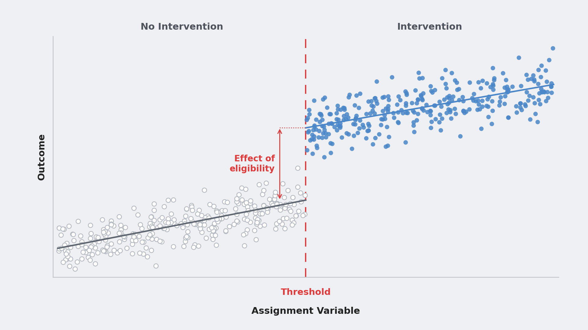
This is where the analysis pivots. The feature is gated at 25 seats. An account with 24 seats cannot access it. An account with 25 seats can. Nothing else about those two accounts is systematically different — same customer tier, same type of administrator, same underlying distribution of organizational readiness. The gate is arbitrary, and arbitrary is exactly what an analyst needs. It is the one part of the rollout where no customer exercised any choice.
**The question:** For accounts near the eligibility threshold, what does gaining access to the AI assistant do to retention? And what does adopting the feature do for accounts whose adoption was specifically induced by becoming eligible?
**What it estimates:** Two local quantities at the 25-seat boundary. The reduced-form effect of eligibility on retention, and the causal effect of adoption for accounts whose adoption behavior changed because the gate moved. This is a fuzzy regression discontinuity design, because eligibility does not force adoption — it only makes adoption possible.
**The hidden assumption:** Everything else that affects retention varies smoothly across the 25-seat line. The only thing that jumps at 25 is whether the account is eligible.
The mechanics are essentially an instrumental variables problem. Eligibility serves as the instrument. Adoption is the treatment. Near the cutoff, the continuity assumption allows us to treat accounts just above and just below the threshold as locally comparable. Eligibility changes who adopts, and nothing else routes from eligibility to retention. That is the exclusion restriction, and two-stage least squares is the natural estimator.
In the simulation, adoption jumps from essentially zero below 25 seats to roughly 37% above it. Retention rises by about 1.8 points at the threshold. Per adopter at the margin, the estimate is approximately 4.9 percentage points, with a confidence interval spanning from negative 2.4 to positive 12.1. The true effect is 4 points. The interval is wide, but it is centered on the truth.
## Two Numbers, Two Questions
The fuzzy regression discontinuity produces two distinct estimates that answer two different business questions.
The first is the reduced-form effect: the effect of eligibility on retention, averaging over both adopters and non-adopters near the threshold. This answers: “If we offer access at this margin, and roughly 37% of accounts take it up, what happens to retention?”
The second is the local average treatment effect (the 2SLS estimate): the effect of adoption specifically for accounts whose adoption was caused by becoming eligible. This answers: “For accounts that adopted because the gate opened, what did the feature do for them?”
Bringing the wrong number to the right meeting is a mistake. If the decision on the table is whether to shift the eligibility threshold, the reduced-form estimate is the one that maps directly to that decision. If the decision is about the intrinsic value of the feature to a customer who uses it, the second estimate is the relevant one. Confusing the two is the same kind of estimand drift as the original naive comparison — just one level more sophisticated.
## Making the Method Credible: Six Diagnostic Checks
An RD estimate without diagnostics is a number. With diagnostics, it becomes an argument. Here are the checks that matter, in the order they should be run.
**Bandwidth sensitivity.** The bandwidth controls how many seats on either side of the cutoff are included. Narrower windows are more credible but noisier. Wider windows are more precise but start absorbing nonlinearities. In practice, the estimate should be stable across a reasonable range of bandwidths. Report the full range of sensitivity results rather than picking the one that looks cleanest.
**Discreteness of the running variable.** Seats are whole numbers. At narrow bandwidths, there may be only a handful of distinct values on the untreated side of the threshold. This means the functional form of the local fit does real work, and specification uncertainty is part of the error budget. This is not a bug unique to this problem — it is the normal state of affairs in SaaS, where gating variables are always counts or tiers. Treating the bandwidth sensitivity table as a primary result rather than a robustness appendix is the right move.
**Placebo cutoffs.** Run the same analysis at seat counts where nothing happens. If retention appears to jump at 15 seats or 35 seats, the design is picking up structure that does not exist. A practical rule: the window around each placebo cutoff should stay entirely on one side of the real threshold to avoid accidentally spanning the actual discontinuity.
**Inventorying other changes at the threshold.** Before trusting the result, check whether anything else changes at 25 seats — pricing tiers, support entitlements, onboarding requirements, account management levels, contract terms. If multiple benefits bundle together at the same threshold, the reduced-form estimate captures the whole bundle, not the AI feature alone, and the instrument is no longer valid. Check the price book before checking the data.
**Smoothness of observed covariates.** Pre-treatment characteristics should not jump at the cutoff. Tenure, for example, should be continuous. In the simulation, the latent engagement variable is also smooth across the boundary. In real data, the unobserved confounder cannot be checked directly — which is exactly why every observed covariate should be examined, and why one should reason carefully about whether the unobserved ones might behave differently.
**Manipulation of the running variable.** This is the diagnostic that most often breaks RD designs in practice. If the sales team knows the AI assistant unlocks at 25 seats, they will push 22-seat accounts to expand to 25 to close the deal. Suddenly the accounts just above the threshold are not comparable to the ones just below — they are the accounts a representative deliberately targeted. A pile-up in the seat histogram at exactly 25 is the telltale sign. The cleanest fix is available only when eligibility was determined from a seat count snapshot taken before the feature was announced, because in that case the snapshot itself is immune to post-announcement gaming.
## Which Number Belongs on the Slide
Four estimates came out of this analysis, and each answers a different question.
The naive adopter gap and the regression-adjusted estimate are both precise and both driven by customer choice, not by the feature. They are confidently wrong about the quantity the business actually cares about.
The two RD estimates are the only ones whose identifying variation comes from the rollout rule rather than from customer preference. They come with honest caveats that should be displayed prominently. The estimates are local — they describe accounts around the 25-seat threshold, not accounts at every size. They apply to a specific population — the accounts whose adoption behavior was actually moved by eligibility — not to every eligible account.
Those caveats are not weaknesses. They are the feature. The naive number has no caveats because its identifying variation is entirely the customer’s choice. It is confidently wrong about everyone. The RD estimates are carefully right about a specific group, and they tell you exactly who that group is.
## When There Is No Threshold
Not every feature ships behind a clean eligibility gate. If the AI assistant was released to all accounts at once with no segmentation rule, the discontinuity design is unavailable. In that case, the analyst must find a different source of variation that customers did not choose. Staggered rollout by region or by acquisition cohort provides timing variation. An in-product prompt shown to a randomized subset provides an instrument for adoption. The principle remains the same: find the part of adoption that was determined by something other than the customer’s free choice, and estimate the effect using only that part.
## Common Pitfalls
**The precision trap.** A tight confidence interval around a biased estimate is the most dangerous output a data team can produce, because it gets acted on. Wide intervals around honest estimates are a feature, not a bug — they communicate how much the data actually supports the claim.
**Post-launch covariates.** Any variable measured after the feature shipped is a potential outcome, not a valid control. Usage, support tickets, customer satisfaction scores, seat expansion — if the feature could have moved it, it does not belong on the right-hand side of a model meant to isolate the feature’s effect.
**Gaming the gate.** If anyone can push an account across the threshold — sales, customer success, the customer themselves — the threshold is no longer arbitrary, and the design is compromised. Check the density of the running variable around the cutoff before doing anything else.
**Treating a discrete running variable as continuous.** Seats are integers. The bandwidth sensitivity table is not a secondary robustness check to append at the end. It is where the specification uncertainty genuinely lives.
**Extrapolating beyond the evidence.** A 5-point effect at 25 seats does not imply a 5-point effect at 250 seats. The effect of adoption is not the same as the effect of offering access. If the business decision involves a different part of the customer base than the one the threshold sits in, state that explicitly and describe the additional assumptions required to extend the estimate.
**Calling the naive gap a lower bound.** The inflated adopter gap in this scenario is nearly four times the true effect. It is not a conservative estimate. It is not a bound on anything. It is simply the wrong quantity.
## FAQ
**Q: Why can’t I just match on pre-launch usage and call it a day?**
A: Pre-launch usage is a useful proxy and certainly better than nothing. But the real confounder is not “how much they used the product” — it is “how ready they are to keep using it,” and that latent readiness is not fully captured by any pre-period metric. Matching on observed usage reduces bias but does not eliminate it.
**Q: What if the eligibility rule was not a seat count but something fuzzy, like “accounts our sales team flagged as high-priority”?**
A: The entire regression discontinuity approach requires that the eligibility rule be as objective and arbitrary as possible. If the gate is subjective, accounts just above and just below it are no longer comparable, because the flagging process itself is selecting for something. In that case, the threshold design breaks down and alternative sources of variation must be sought.
**Q: Is it always better to use RD than to run a fancier observational model?**
A: Not necessarily. RD is the right tool when a credible, arbitrary threshold exists and the business question is about the marginal effect at that threshold. If the question is about the average effect across the entire customer base, and the threshold sits at an unrepresentative point, RD may not be the appropriate method. The choice of method should follow the business question, not the other way around.
**Q: How wide should the bandwidth be?**
A: There is no universal answer. The bandwidth should be narrow enough that the continuity assumption is plausible — that accounts just above and just below the cutoff are genuinely similar — but wide enough to contain sufficient statistical power. Reporting the estimate across multiple bandwidths and checking for stability is standard practice. A range of results is more informative than a single “optimal” choice.
**Q: What does it mean if the RD estimate has a very wide confidence interval?**
A: It means the threshold contains limited statistical information. Adoption may be rare near the cutoff, or the outcome jump may be small relative to the noise in the data. A wide interval is an honest reflection of what the data can and cannot support. It is not a reason to abandon the method — it is a reason to collect more data or to couple the RD estimate with other evidence.
**Q: Can this approach work for features that are not AI-related?**
A: Absolutely. Any opt-in feature gated by a clear eligibility rule suffers from the same selection problem. The method applies to any scenario where adoption is voluntary and a threshold determines who can access the feature. AI features are simply particularly prone to the trap because the selection chain from adoption to organizational readiness is so long and visible.
## Conclusion
The comparison between adopters and non-adopters has always been a description of who chose the feature, not a measurement of what the feature does. AI features make this problem worse because the path from adoption to retention runs through so many layers of organizational behavior that the selection signal is enormous.
The path forward is conceptually simple but analytically demanding. Find the part of the rollout that customers did not choose — the eligibility rule, the threshold, the arbitrary gate — and build the analysis around that variation. The estimates will be local, imprecise, and honest. Those three properties are exactly what a decision-ready analysis needs.
The adoption slide was never measuring the feature. It was measuring the customers who chose it. The threshold that governed access to the feature is the only part of the rollout untouched by customer choice, and that is precisely why it is the part of the rollout worth learning from.
Thank you for reading
