


Welcome to my series on Outlier Detection. This article focuses on handling categorical data.
When tackling outlier detection in tabular data, the initial step is usually transforming the dataset so it becomes either fully categorical or fully numeric. While exceptions exist, this conversion is generally essential: most outlier detection algorithms are built to work with data in a single format, and we must adapt our data to match what the detector requires.
When the detector requires categorical input, numeric features must be converted into categories, typically through binning. Conversely, when the detector expects numeric input, categorical features need numerical encoding. This latter situation is more prevalent (the bulk of outlier detection algorithms expect numeric data), and it’s the focus of this article.
Other articles in this series cover: Deep Learning Approaches for Outlier Detection on Tabular and Image Data, Distance Metric Learning for Outlier Detection, An Introduction to PCA-Based Outlier Detection, Interpretable Outlier Detection: Frequent Patterns Outlier Factor (FPOF), and Improving Outlier Detection Through Feature Subsets.
This article also draws upon material from the book Outlier Detection in Python.
Outlier Detectors
Examples of outlier detection algorithms designed for categorical data include: Frequent Patterns Outlier Factor (FPOF), Association Rules, and Entropy-based approaches. Algorithms that work with numeric data include: Isolation Forests, Local Outlier Factor (LOF), kth Nearest Neighbors (kNN), and Elliptic Envelope.
If you’ve encountered any outlier detection algorithms, you’re probably more familiar with the numeric ones, especially Isolation Forest and LOF; these are likely the most widely used. Moreover, every outlier detection algorithm bundled in scikit-learn and in PYOD (Python Outlier Detection) expects entirely numeric data.
At the same time, the vast majority of real-world tabular data is actually mixed (containing both numeric and categorical columns), which means encoding categorical columns is a very common necessity in outlier detection workflows.
There’s a reason for this: mixed data makes outlier detection more challenging. Working with a single data type (all categorical or all numeric) simplifies the task of identifying the most unusual records.
Furthermore, with numeric data, we gain the advantage of being able to visualize the data geometrically: as points in space. If a table has, say, 20 numeric columns, each data row can be thought of as a point in 20-dimensional space. We can at least conceptualize this in 20-d space—the human mind can’t truly picture it. But we can visualize 2d and 3d spaces and extend the general principle: we’re searching for points that are physically very far from most other points. For instance, in 2d, we might have data like this:
Here, we assume the data has just two features, labeled A and B, both containing numeric values. Each row is plotted as either a blue dot or a red star, positioned according to its A and B values. The blue dots represent normal data, while the red stars mark a subset of points that could reasonably be considered outliers: some points on the edges of clusters, and points lying outside the clusters entirely (the data contains three main clusters, along with some points beyond them).
This perspective feels intuitive in lower dimensions. The situation shifts in high dimensions due to what’s known as the curse of dimensionality, and we do need to account for that. Still, conceptually, the notion of outliers as relatively isolated points in high-dimensional space is fairly easy to grasp.
Most numeric outlier detectors operate by computing distances between every pair of points, then using those distances to flag the most unusual points—the ones that have few neighbors nearby and lie far from the majority. In practice (for efficiency), the algorithms won’t actually compute every pairwise distance (some can be omitted without substantially affecting the outlier scores), but in principle, this is what most numeric outlier detectors are doing.
We therefore need methods for converting categorical data into a numeric format that supports this approach well—one that makes distance calculations between rows meaningful after encoding categorical values as numbers.
Methods to encode categorical data
In prediction tasks, the most frequently used encoding methods tend to include:
- One-hot encoding
- Ordinal encoding
- Target encoding
For outlier detection, the set of suitable options differs, and the trade-offs between them shift as well. Of the three methods listed above, only One-hot encoding genuinely works well for outlier detection. The most effective choices for outlier detection are likely:
- One-hot encoding
- Count encoding
I’ll walk through how each method works and why some outperform others in the context of outlier detection. I’ll also explain why Count encoding—rarely used in prediction tasks—can be quite valuable for outlier detection.
I should also note that beyond these encoding methods, several others can be useful for prediction. An excellent library for encoding techniques is Category Encoders. It likely covers any method you’d need. However, many of the methods it offers, such as Target encoding and CatBoost encoding, require a target column, which is typically unavailable in outlier detection settings.
For instance, imagine a table containing historical customer records for a business. There might be a categorical column called “Last Product Purchased” and a target column labeled “Will Churn in next 6 Months.” The “Last Product Purchased” column could contain distinct values like “Product A,” “Product B,” and “Product C.” To encode these, we could calculate how often the target column is True for each category (in the training data), perhaps encoding them as 0.12, 0.43, and 0.02 (meaning, when ‘Last Product Purchased’ is Product A, the target is True 12% of the time, and the customer churns within six months; similarly for Product B at 43% and Product C at 2%).
But in outlier detection, we operate in a strictly unsupervised setting: there’s no ground truth label indicating how outlier-like each row is, and therefore no way to define a Target column. We can only use unsupervised encoding methods, such as One-hot and Count encoding.
One-hot encoding
To examine One-hot encoding, let me start
Let’s first walk through how this process is done, and then examine how it interacts with distance calculations. As a starting point, consider a table structured like this:
This checks whether features share the same value or not.
Applying one-hot encoding to the original dataset (from Table 3) produces:
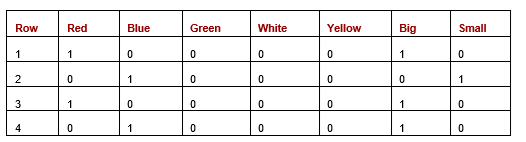 Table 5: Dataset after one-hot encoding
Computing the pairwise distances between rows using one-hot encoding with either Manhattan or Euclidean metrics yields the results shown in the following table. Since all encoded values are either 0 or 1, Manhattan and Euclidean distances turn out to be identical here.
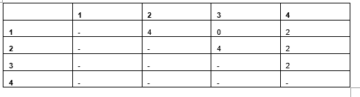 Table 6: Pairwise Manhattan/Euclidean distances
With Manhattan (or Euclidean) distance, the results are proportional to the simple matching count approach used in Table 4, but the values are doubled. This doubling occurs because each mismatched value in the original data creates two mismatched cells in the one-hot representation. While this isn’t typically an issue for purely categorical datasets, it does introduce complications when dealing with mixed data types.
Take, for instance, Table 7, which contains two features: a categorical column (Color) and a numeric column (Weight).
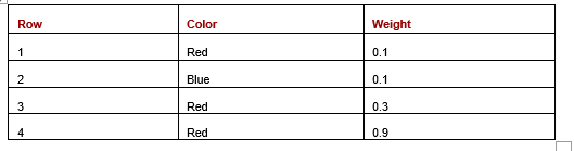 Table 7: Dataset with one categorical and one numeric feature
After one-hot encoding, the result is Table 8:
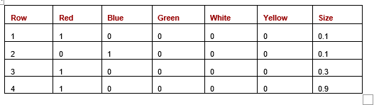 Table 8: One-hot encoding applied to a mixed dataset
Computing Euclidean distances between the rows (Manhattan, Canberra, or other metrics could also be used, but Euclidean is used here for illustration) gives us the following results (Table 9):
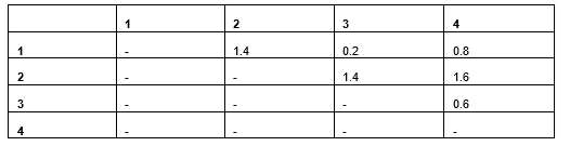 Table 9: Euclidean distance results
Rows 1 and 2 differ only in Colour (their weights are identical), yielding a Euclidean distance of 1.4. Rows 3 and 4 differ only in Weight (their colors match), producing a Euclidean distance of just 0.6. This reveals that Colour differences dominate the distance calculation far more than Weight differences, even though that may not be the intended behavior.
Two factors cause categorical features to exert disproportionate influence compared to numeric ones. First, matches and mismatches affect two one-hot columns simultaneously, whereas numeric differences affect only a single column. Second, distances in binary columns tend to be larger than those in numeric features. For example, Row 1 and Row 4 have Weight values of 0.1 and 0.9, a substantial difference of 0.8 — yet this is still smaller than the 2.0 difference produced by two mismatching categorical values (since two binary columns will differ).
A code example demonstrating Manhattan and Euclidean distance calculations is shown below. In the first scenario, two vectors are created representing the first two rows from the earlier data, with five one-hot columns for Colour and one column for Weight. Another pair of vectors is then constructed to simulate a lower cardinality for Color, using only two binary columns.
The following code tests Manhattan and Euclidean distances:
from sklearn.metrics.pairwise import euclidean_distances,
manhattan_distances

# Simulates two rows with five binary columns representing
# one categorical feature
row_1 = [1, 0, 0, 0, 0, 0.1]
row_2 = [0, 1, 0, 0, 0, 0.1]
print(manhattan_distances([row_1], [row_2]))
print(euclidean_distances([row_1], [row_2]))

# Simulates similar data but with only two binary columns for
# one categorical feature
row_1 = [1, 0, 0.1]
row_2 = [0, 1, 0.2]
print(manhattan_distances([row_1], [row_2]))
print(euclidean_distances([row_1], [row_2]))
Notably, in both cases, the two rows produce a Manhattan distance of 2.1 and a Euclidean distance of 1.4. Even when using just two binary features for Colour instead of five, the distances remain unchanged. Similarly, increasing the cardinality (representing color with more than five binary columns) has no effect on the distance measures. No matter how many one-hot columns represent Colour, if two rows share the same color, there will be 0 differences; if they differ in color, there will be exactly 2 differences (all other columns will be zero and therefore match).
So, while there is indeed an imbalance between categorical and numeric features, it is not exacerbated by the cardinality of the categorical features.
My recommendation to reduce the overemphasis in distance calculations is to replace the 1.0 values in the one-hot columns with 0.25. This adjustment causes rows with different values to have a total difference (with respect to that original column) of 0.5 instead of 2.0, bringing it more in line with the scale of numeric features.
Ordinal encoding
Ordinal encoding works by assigning a unique integer to each distinct value in a categorical column. In the example above, the Colour column values might be mapped as follows:
red: 1
blue: 2
green: 3
white: 4
yellow: 5
All instances of “red” would be replaced with 1, and so on. The same approach applies to the Size column: “small” could be replaced with, say, 1 and “big” with 2, or with any other numeric values.
As noted, this technique actually works reasonably well for Isolation Forest. However, it tends to perform poorly for most other numeric outlier detectors, including distance-based methods. Ordinal encoding does avoid creating additional columns — each categorical column is converted into a single numeric column — but the resulting distance calculations become meaningless.
Using the values above, rows with “yellow” would be considered 4.0 units away from rows with “red,” while rows with “white” would be only 1.0 unit away from rows with “yellow,” which makes little sense. The distances end up being entirely arbitrary.
Count encoding
Count encoding is actually a far more important encoding technique for outlier detection than for prediction. Like Ordinal encoding, it converts each categorical column into a single numeric column, but it does so in a way where the numeric values are not random — they carry meaning, and meaning that is directly relevant to outlier detection.
Count encoding also produces numeric values that work naturally with distance calculations.
With Count encoding, the generated numeric values represent the frequency of each value (rare values receive small numbers and common values receive large numbers), which provides genuinely useful information for outlier detection tasks.
Looking at the Staff Expenses table, if the Department values are distributed as follows:
Sales: 1,000
Marketing: 500
Engineering: 100
HR: 10
Communications: 3
These counts are used as numerical encodings. For instance, the 1,000 entries labeled “Sales” are assigned the number 1,000, the 500 entries for “Marketing” receive 500, and so on. One key benefit of this approach is that it naturally separates rare values from more common ones. For example, the categories with counts 10 and 3 (HR and Communications) have similar numeric values, placing their 13 records close together in value space. However, because there are only 13 such records, they remain quite distant from the remaining 1,600 entries. Conversely, the Sales category has a high encoding value of 1,000, which is well-separated from other values, but its 1,000 records are densely packed together (each close to 999 others), so they aren’t flagged as outliers.
The code below creates a simple dataset with one categorical feature (department) and builds a Local Outlier Factor (LOF) model to detect anomalies. If you were using multiple columns for detection, features created by Count encoding would need to be scaled so all features have comparable ranges. However, because this example only uses a single feature, scaling isn’t necessary. The model successfully identifies the rare categories as outliers: the 13 least common records are given a prediction of -1 (signifying an outlier in scikit-learn), while the remainder are labeled 1 (representing normal data points).
import numpy as np
import pandas as pd
from sklearn.neighbors import LocalOutlierFactor

# Creates a dataset with a single categorical column
vals = np.array(['Sales']*1000 + ['Marketing']*500 + ['Engineering']*100 +
['HR']*10 + ['Communications']*3)

# Count-encode the column
df = pd.DataFrame({"C1": vals})
vc = df['C1'].value_counts()
map = {x:y for x,y in zip(vc.index, vc.values)}
df['Ordinal C1'] = df['C1'].map(map)

# Uses LOF to determine the outliers in the column
clf = LocalOutlierFactor(contamination=0.01)
df['LOF Score'] = clf.fit_predict(df[['Ordinal C1']])
One minor drawback of Count encoding is that different original categories might technically be assigned the same numerical value if they appear with the exact same frequency. For instance, if both Sales and Marketing appeared 1,000 times, they would both be converted to the value 1,000. Similarly, if one had 1,000 occurrences and the other 1,001, they’d end up with nearly identical encodings. While most anomaly detectors can handle this, Isolation Forest is a bit unique; it works best when it can easily distinguish between truly distinct values. For such cases, Ordinal encoding is often a better choice.
Determining the best encoding method
The most effective encoding technique will depend on your chosen dataset, the specific outlier detection algorithm you’re using, and the nature of the anomalies you’re looking for. Just as with many aspects of data science, there isn’t a single “best” answer—each method has its own strengths depending on the circumstances. In fact, in many real-world situations, it might be best to apply different encoding techniques to different features within the same dataset.
A common strategy in outlier detection is to use an ensemble approach. This involves running the detection multiple times with different ways of encoding the rows. Records that are truly anomalous will appear as outliers regardless of the encoding used. However, records that are only slightly unusual might only be flagged as outliers with one specific encoding method compared to another.
Selecting an encoding method is often much simpler for standard prediction tasks. With these tasks, we usually have a validation set and can easily test different methods to see which one performs best experimentally. However, outlier detection tasks are typically completely unsupervised (since there’s no target column or “ground truth” labeling exactly how much of an outlier each observation is). Because of this, evaluating encoding choices is more challenging. However, we can use a process called “Doping” to help evaluate different outlier detection systems.
Furthermore, if the detection system is designed to run on an ongoing basis, we may eventually be able to collect manually labeled data. This data can then be used to assess and compare various preprocessing strategies, including how we handle the encoding of categorical columns.
Scaling
If a dataset contained nothing but numbers from the start, we wouldn’t need to worry about encoding categories. However, we’d still need to scale the data for most numeric-based outlier detectors. While Isolation Forest is a notable exception, almost any algorithm that relies on distance calculations requires that every dimension (or feature) is adjusted to a uniform scale. If this isn’t done, the calculated distances—whether between data points or between points and cluster centers—will be heavily skewed by features that just happen to have larger numerical ranges.
It’s important to remember that scaling is still vital even after you’ve converted categorical columns into numbers. No matter which encoding technique you choose, the resulting numeric values might end up on completely different scales compared to your original numeric features (such as transformed date or time data). And if different categorical columns were encoded using different methods, they can also end up with wildly different scales compared to one another.
Fortunately, once categorical data is in numeric form, we can scale them using the exact same techniques used for any other numeric column. Just be sure to include these new columns in your scaling process. Typically, you would choose between min-max scaling, robust z-scaling, or spline scaling to normalize the data. This process will be explained more thoroughly in a follow-up article.
All images were by the author