




## **Turn Any CSV into an Executive Report with Python and AI**
### **Moving Beyond Analysis By Hand**
Every analyst has experienced this scenario: a CSV file lands in your inbox, a stakeholder asks “so how did we do?”, and you spend an afternoon manually cleaning columns, building charts, and writing a narrative. This workflow is inefficient and error-prone.
The good news is that most of this process can be automated. In this walkthrough, we build a small but powerful pipeline in Python that takes a raw sales CSV, cleans it, performs analysis, creates visualizations, and uses AI to draft the insights. The AI component uses **Claude Opus 4.8**, which writes the first draft of the narrative in seconds—**but humans still decide what’s true**.
The entire process follows this sequence:
**CSV → clean → explore → chart → AI insights → recommendations → report**
Before any analysis begins, the report needs a clear question. In this case, our question is: *how much revenue did we keep over these five weeks, and where did the rest go?* Every step in the pipeline answers a piece of this question. Cleaning determines which rows count as money, aggregation reveals where and when revenue was lost, and the AI step translates those numbers into an executive-friendly summary.
All the code is provided below so you can reproduce this process with your own data. The steps are applicable to almost any dataset.
### **The Data**
We use the `product_sales.csv` file, which contains 45 transaction rows. This dataset is commonly used in interview questions. Each row represents a payment event—either a purchase or a refund—with information about the country, date, amount, and status.
Here’s a preview of the raw data:
| transaction_id | product_id | country | transaction_date | amount | status | type | original_transaction_id |
|—————-|————|———|——————|——–|——–|——|————————-|
| TXN-10001 | PROD-2891 | US | 2025-04-15 | 449.99 | completed | purchase | |
| TXN-10002 | PROD-2891 | US | 2025-04-15 | 449.99 | completed | purchase | |
| TXN-10003 | PROD-2891 | CA | 2025-04-15 | 449.99 | completed | purchase | |
| TXN-10004 | PROD-2891 | US | 2025-04-17 | 449.99 | completed | purchase | |
| … | … | … | … | … | … | … | … |
| TXN-10045 | PROD-2891 | US | 2025-05-11 | -449.99| completed | refund | TXN-10044 |
Two important observations about this data:
1. Refunds are stored as negative amounts
2. Not every row represents a completed sale—some are pending or failed
We use Pandas to load the data:
“`python
import pandas as pd
df = pd.read_csv(“product_sales.csv”)
“`
### **Cleaning the Data**
The cleaning step is crucial because it determines whether our totals are accurate. Three rows were pending or failed, so they are not revenue yet. We fix the data types and keep only completed transactions:
“`python
df[“transaction_date”] = pd.to_datetime(df[“transaction_date”])
df[“amount”] = pd.to_numeric(df[“amount”], errors=”coerce”)
# Pending and failed transactions are not revenue yet.
settled = df[df[“status”] == “completed”].copy()
settled[“is_refund”] = settled[“type”].eq(“refund”)
“`
This simple cleaning step drops 3 of 45 rows, leaving 42 completed transactions. If we had reported directly from the raw file, we would have incorrectly counted a failed payment as a sale.
### **Exploratory Analysis**
The first half of our question asks: *how much did we keep?* We separate purchases from refunds. Since refunds are already negative amounts, net revenue is simply the sum of the `amount` column:
“`python
gross = settled.loc[~settled[“is_refund”], “amount”].sum()
refunds = settled.loc[settled[“is_refund”], “amount”].sum() # negative
net = settled[“amount”].sum()
refund_rate = -refunds / gross
print(f”gross {gross:,.0f}”)
print(f”refunds {refunds:,.0f}”)
print(f”net {net:,.0f}”)
print(f”refund rate (value) {refund_rate:.0%}”)
“`
**Output:**
“`
gross 12,975
refunds -4,875
net 8,100
refund rate (value) 38%
“`
This is the complete story in just a few lines: we sold approximately $13,000 and refunded $4,875, resulting in net revenue of $8,100. A 38% refund rate is surprisingly high, and this number would be invisible if we only summed positive amounts.
The second half of the question asks: *where did the money go?* We analyze by country and by week.
**By Country:**
“`python
by_country = (settled.groupby(“country”)[“amount”]
.agg(net_revenue=”sum”, transactions=”count”)
.sort_values(“net_revenue”, ascending=False))
print(by_country)
“`
| country | net_revenue | transactions |
|———|————-|————–|
| US | 7,199.84 | 38 |
| GB | 449.99 | 1 |
| MX | 449.99 | 1 |
| CA | 0.00 | 2 |
Canada is a surprise: two completed orders, both refunded, resulting in zero net revenue.
**By Week:**
“`python
settled[“week”] = settled[“transaction_date”].dt.to_period(“W”).dt.start_time
weekly = settled.pivot_table(index=”week”, columns=”is_refund”,
values=”amount”, aggfunc=”sum”).fillna(0)
weekly.columns = [“purchases”, “refunds”]
weekly[“net”] = weekly.sum(axis=1)
print(weekly)
“`
| week | purchases | refunds | net |
|——|———–|———|—–|
| 2025-04-14 | 4,649.89 | -449.99 | 4,199.90 |
| 2025-04-21 | 4,274.90 | -299.99 | 3,974.91 |
| 2025-04-28 | 3,599.92 | 0.00 | 3,599.92 |
| 2025-05-05 | 449.99 | -1,799.96 | -1,350.97 |
| 2025-05-12 | 0.00 | -1,424.96 | -1,424.96 |
| 2025-05-19 | 0.00 | -899.98 | -899.98 |
The first three weeks show net positive revenue; the last three weeks are net negative as refunds continued after purchases stopped.
To understand the delay in refunds, we calculate the median time between purchase and refund:
“`python
purch_dates = (settled.loc[~settled[“is_refund”], [“transaction_id”, “transaction_date”]]
.set_index(“transaction_id”)[“transaction_date”])
ref = settled[settled[“is_refund”]].copy()
ref[“lag_days”] = (ref[“transaction_date”]
– ref[“original_transaction_id”].map(purch_dates)).dt.days
print(ref[“lag_days”].median()) # 20.0
“`
The median refund arrives 20 days after the sale, meaning April revenue is still being refunded in May.
### **Building the Charts**
We create three visualizations using Matplotlib:
1. **Weekly Purchases vs Refunds:**
“`python
import matplotlib.pyplot as plt
weekly[[“purchases”, “refunds”]].plot(kind=”bar”, color=[“#2a9d8f”, “#e76f51″])
plt.axhline(0, color=”black”, linewidth=0.8)
plt.title(“Weekly gross purchases vs refunds”)
plt.tight_layout(); plt.savefig(“chart_weekly.png”)
“`
2. **Cumulative Net Revenue Over Time:**
“`python
settled.groupby(“transaction_date”)[“amount”].sum().sort_index().cumsum().plot()
plt.title(“Cumulative net revenue over time”)
plt.tight_layout(); plt.savefig(“chart_cumulative.png”)
“`
3. **Net Revenue by Country:**
“`python
by_country[“net_revenue”].plot(kind=”barh”, color=”#2a9d8f”)
plt.title(“Net revenue by country”)
plt.tight_layout(); plt.savefig(“chart_country.png”)
“`
### **Generating AI Insights**
We summarize the findings for the AI:
“`python
weekly_net = {d.date().isoformat(): round(v) for d, v in weekly[“net”].items()}
summary = f”””Product sales, {settled[‘transaction_date’].min().date()} to {settled[‘transaction_date’].max().date()}.
Gross: ${gross:,.0f} Refunds: ${-refunds:,.0f} Net: ${net:,.0f}
Refund rate by value: {refund_rate:.0%}
Net revenue by country: {by_country[‘net_revenue’].round(0).to_dict()}
Weekly net: {weekly_net}
Median days from purchase to refund: 20″””
prompt = (
“You are a data analyst writing for executives. ”
“Based on this summary, write 3 insights and 3 business ”
“recommendations. Be specific and cautious about small sample size.nn”
+ summary
)
print(prompt)
“`
When this prompt was given to **Claude Opus 4.8**, it generated the following insights and recommendations:
> You are a data analyst writing for executives. Based on this summary, write 3 insights and 3 business recommendations. Be specific and cautious about small sample size.
>
> Product sales, 2025-04-15 to 2025-05-22.
> Gross: $12,975 Refunds: $4,875 Net: $8,100
> Refund rate by value: 38%
> Net revenue by country: {‘US’: 7200.0, ‘GB’: 450.0, ‘MX’: 450.0, ‘CA’: 0.0}
> Weekly net: {‘2025-04-14’: 4200, ‘2025-04-21’: 3975, ‘2025-04-28’: 3600, ‘2005-05-05’: -1350, ‘2025-05-12’: -1425, ‘2025-05-19’: -900}
> Median days from purchase to refund: 20
**Insights:**
1. The business generated $8,100 in net revenue over five weeks, but the 38% refund rate indicates significant customer dissatisfaction or issues with expectations.
2. The US market is the primary driver of revenue ($7,200), while GB and MX each contributed $450, and Canada resulted in no net revenue due to full refunds.
3. Revenue declined sharply after week 3, turning negative in week 4, suggesting a drop in new purchases coupled with a wave of refunds.
**Recommendations:**
1. Investigate the high refund rate, particularly for products sold to Canada and in the later weeks, to identify product or expectation mismatches.
2. Focus retention efforts on US customers, who generated the majority of revenue, to encourage repeat purchases.
3. Monitor week 4 and 5 trends closely; the negative net revenue warrants immediate action to prevent further losses.
The AI read the summary numbers and produced clear, cautious insights, correctly flagarding the small sample size and potential limitations.
### **Assembling the Executive Report**
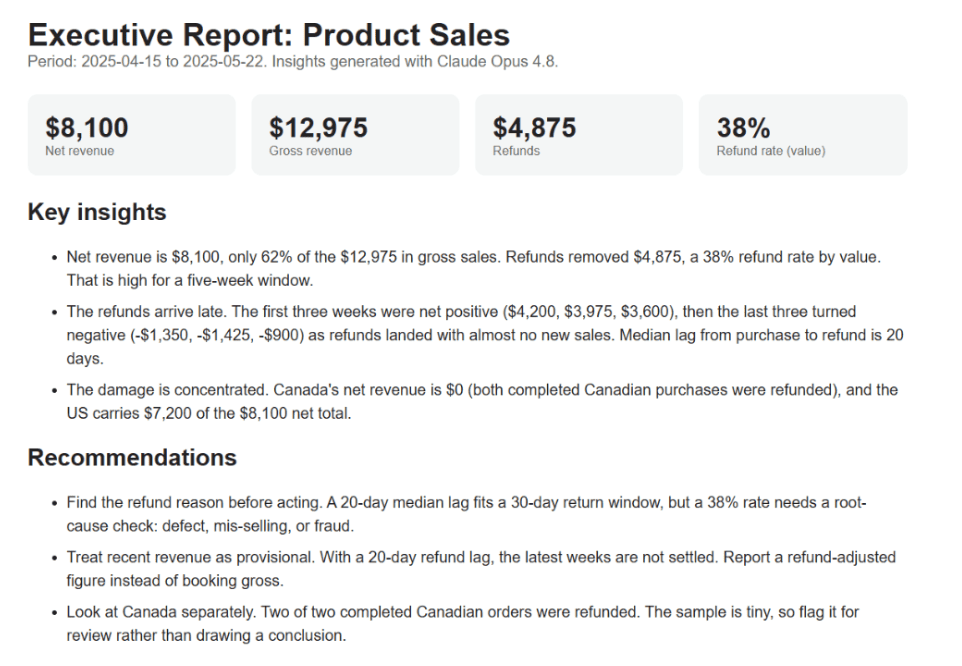
The final step assembles a self-contained `report.html` file. This report includes:
* Key metrics displayed as cards
* The three charts generated earlier
* The AI-generated insights and recommendations
The complete builder script can be found in the companion file, but the final output looks like this:
### **Conclusion**
This pipeline demonstrates a powerful approach to automated reporting: clean the data, compute honest aggregates, visualize the trends, and let an AI draft the narrative. The critical thinking and verification remain the human’s responsibility—the AI simply saves hours of writing and formatting.
The data cleaning and aggregation steps determine whether the report is accurate. Once those are solid, tools like **Claude Opus 4.8** can quickly transform numbers into actionable business insights.
You can run this companion script on any CSV file, adjust the column names as needed, and have a professional reporting tool ready for the next file in your inbox.
—
**Nate Rosidi** is a data scientist and in product strategy. He’s also an adjunct professor teaching analytics, and is the founder of StrataScratch, a platform helping data scientists prepare for their interviews with real interview questions from top companies. Nate writes on the latest trends in the career market, gives interview advice, shares data science projects, and covers everything SQL.
