



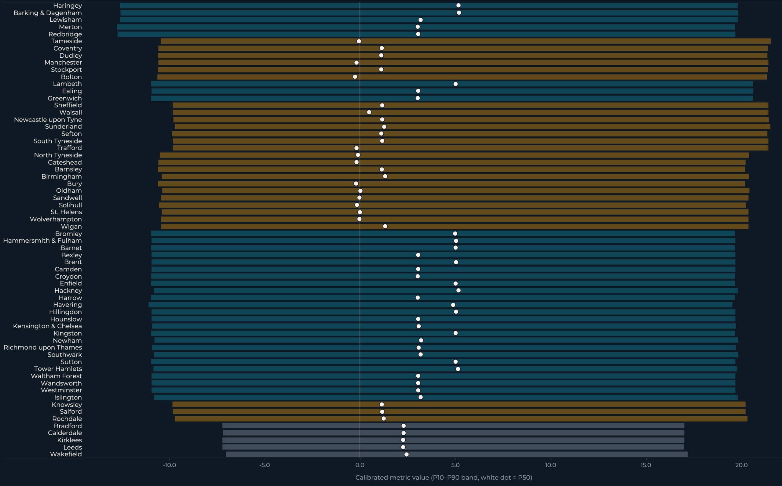
Across 64 English councils and six 2026 scenarios, even the most extreme scenario shock amounted to just 13% of the median uncertainty range.
Put simply: the model’s assumptions shifted the outcome less than past forecasting errors have. The most dramatic challenger surge I could configure falls within the range of noise the model has generated in previous elections. That’s not a flaw — it’s the finding.
I developed this scenario model expecting clear distinctions between assumptions. I anticipated S3, the challenger surge, to stand out. I expected defensible rankings. Instead, I found a range where the strongest shock sits within calibrated uncertainty, and where rankings collapse when intervals are overlaid on them.
This is the second part of a project examining English local electoral data. Part 1 fixed a categorical-normalisation bug that had flipped the original headline result. Part 2 picks up from the corrected baseline and poses a different question: given the historical volatility we now measure accurately, which 2026 scenarios are worth exploring, and how should we interpret them when uncertainty exceeds the shocks?
What was modelled
The 2026 English local elections are set for Thursday 7 May 2026. This project encompasses 64 active councils holding elections that day: 32 London boroughs, 27 metropolitan boroughs, and 5 West Yorkshire authorities. Six scenarios apply varying assumptions to the same historical baseline. Four metrics are calculated for each scenario × authority pairing: volatility_score, delta_fi, swing_concentration, and turnout_delta. The model generates 1,536 output rows, each with a point estimate alongside calibrated P10, P50, and P90 values drawn from 2,000 samples of the empirical error distribution.
| Scenario | Question | Main assumption |
|---|---|---|
| S0 | What if no new swing is applied? | Historical uncertainty only |
| S1 | What if 2018–2022 challenger patterns continue? | Continuation of recent challenger churn |
| S2 | What if major parties partially recover? | Establishment recovers half of lost share |
| S3 | What if challengers surge harder? | Stress test: +4pp challenger surge |
| S4 | What if deprivation-linked turnout rises? | +3pp turnout in IMD deciles 1–3 |
| S5 | What if London volatility is capped by history? | London P90 upper-tail cap |
Each scenario represents a controlled adjustment. Labels describe assumptions, not predictions. The full interactive dashboard is available on Tableau Public.
Two definitions to keep in mind throughout the rest of this article: scenario shock refers to the shift in the scenario point estimate relative to the baseline. Uncertainty width is the P10-to-P90 interval calibrated from historical forecast error. The 13% headline figure is the former divided by the latter.
Method: backtest errors as the empirical uncertainty distribution
Backtest errors aren’t just a scorecard — they can serve as the empirical uncertainty distribution for future scenario analysis.
The conventional use of a backtest is pass/fail. Did the predictions match held-out reality? That tells you whether the model worked, but it discards the residuals.
An alternative approach treats those residuals as a distribution. How far off has the model been across boroughs and cycles, in which direction, and with what spread? The result becomes the empirical sample from which future uncertainty bands are drawn. Predictive bands cease to be parametric assumptions about how errors ought to behave. Instead, they are bootstrapped from how errors have actually behaved.
This model uses backtests in that second sense. Tier-level mean-centred historical error pools from the 2014→2018 training window and the 2018→2022 backtest form the bootstrap pool from which 2026 uncertainty bands are sampled. In practical terms, the model is asking: how much movement would qualify as genuinely unusual compared to the noise it has produced before?
Two design decisions shape the calibration.
Errors are pooled at the tier level, not at the borough level. Each borough has only 1–2 prior observations — too few to characterise a residual distribution reliably. Pooling at the tier level (London, Metropolitan, West Yorkshire) maintains a sample large enough to be meaningful while preserving the structural distinction between geographies that have historically behaved differently.
Errors are mean-centred before sampling. This separates historical bias from uncertainty spread. Without centring, S0’s P50 would drift away from zero due to historical mean error, conflating the model’s track record of being slightly off with the median of the band. After centring, the band reflects dispersion around the scenario assumption rather than dispersion around the model’s bias.
One subtlety worth noting: mean-centring removes average historical bias but doesn’t force the bootstrap median to equal the point estimate. When residual pools are skewed or bounded (swing_concentration has a lower bound of 1.0), the P50 can still sit slightly away from the assumption. Reporting P10/P50/P90 separately, rather than mean ± standard deviation, preserves that asymmetry.
The 2,000 draws yield stable percentile estimates while keeping the full output under 10,000 rows for clean Tableau ingestion.
Data science takeaway: Backtest errors aren’t just a scorecard — they can serve as the empirical uncertainty distribution for future scenario analysis, calibrating bands that reflect how the model has actually been wrong.
The result: shocks smaller than uncertainty
Three numbers capture the finding:
- S3 challenger surge: 13% of the median volatility interval.
- S1 volatility continuation: 6%.
- S2 establishment recovery: 5%.
Each figure represents the scenario shock divided by the median P10-to-P90 band width across the 64 active councils. The strongest shock — a +4pp challenger surge — shifts the central estimate by roughly one-eighth of the historical noise the model has produced in past cycles.
The result I least expected is the most significant: the scenarios are less distinct from each other than the uncertainty bands are wide. If this were a forecasting dashboard, that would be disappointing. For a scenario analysis, it’s precisely the point.
Filter context: Scenario = S3; Sort = Uncertainty band width; Metric locked to volatility_score. Each row represents a single authority. The bar shows the P10-P90 range. The white dot marks the P50. The inset displays each scenario shock as a percentage of the median band width.
How to interpret the chart: each horizontal bar represents one authority’s calibrated uncertainty range. The white dot within it indicates the calibrated median. The bar’s color denotes geography, not analysis (teal = London, amber = Metropolitan, slate = West Yorkshire). The amber rings indicating each scenario’s point estimate appear on the rankings panel (Figure 2b); in Figure 1, they are summarized in the inset percentages.
Across 64 authorities and the three active scenarios, the point estimate almost always falls within the bar. The shock disturbs the model less than the model has historically disturbed itself.
Part 1 found that the correlation between turnout change and volatility was statistically insignificant (r = -0.12, p = 0.35). Part 2 reveals that scenario shocks are similarly smaller than the uncertainty surrounding them. The pattern holds: when an effect’s magnitude is comparable to or smaller than the noise, ranking those effects creates a false sense of precision. Effect-versus-uncertainty determines whether a result should be treated as a meaningful signal or as background context.
The dashboard does not declare “S3 wins.” It indicates that S3 shifts the envelope the most while still falling within broad empirical uncertainty. “Wins” suggests the model has selected a preferred scenario. It has not. One scenario nudges the central estimate slightly more than the others; the band around all three remains wide enough to absorb that difference.
Data science takeaway: Always measure effect size against uncertainty width. A scenario shock that appears large in isolation may be modest relative to historical error.
Reading the dashboard: geography and rankings
Two views translate the headline finding into geographic and ranked context.
The map displays the uncertainty footprint for one scenario at a time. Color encodes the P50 under the selected scenario; size encodes interval width. The widest bands are not confined to London. Metropolitan boroughs in the North East, North West, and West Yorkshire show interval widths on par with the densest London cluster.

The rankings view is where the effect-versus-uncertainty comparison becomes most difficult to overlook. Each row displays three marks: the bar (P10-P90), the white dot (P50), and the amber ring (scenario point estimate). The amber ring nearly always falls within the bar, meaning the scenario shock is smaller than the historical uncertainty even for the authorities placed at the top of the ranking.

Rankings of uncertain estimates need their intervals displayed alongside them. A ranked list without uncertainty invites false precision: the reader sees Authority A above Authority B and assumes the model is confident about that ordering. When the bands overlap, as they do at every level of these rankings, that confidence is unjustified.
Two asymmetric scenarios, two design lessons
Two of the six scenarios behave differently from the rest. S4 and S5 do not follow the same vote-share-perturbation logic as S1, S2, and S3, and the distinction makes them valuable design demonstrations beyond the election context.
S4 lesson: isolate one mechanism at a time.
S4 tests a hypothesis drawn from UK turnout literature: that elections in more deprived authorities can experience turnout shifts when local salience changes. It applies a +3 percentage point turnout shock to authorities in IMD deciles 1-3 under the LAD-level Index of Multiple Deprivation (IMD 2019) overlay. 41 of the 64 active authorities receive the shock; 23 do not. The tier split: 13 of 32 London boroughs, 23 of 27 metropolitan boroughs, all 5 West Yorkshire authorities. Within this scenario’s scope, the shock is concentrated more among Metropolitan and West Yorkshire authorities than among London boroughs.

Vote-share metrics (fragmentation, volatility, swing concentration) are carried over from S0 unchanged under S4. The scenario is turnout-only by design.
That design choice is the lesson itself. By restricting S4 to a single perturbation channel, the assumption can be tested on its own terms. If observed 2026 turnout shifts in IMD-1-to-3 authorities fall outside the +3pp range, the assumption fails without undermining the vote-share narrative alongside it. A scenario that perturbs three mechanisms at once is harder to learn from when reality disagrees. You cannot pinpoint which assumption broke.
S5 lesson: log guardrails even when they do not bind.
S5 caps the upper tail of London volatility_score at 39.45. The cap is set at the empirical 90th percentile of historical London borough volatility across the training and backtest windows: 64 London borough observations (32 from training, 32 from backtest, City of London excluded because it falls outside the 32-borough London electoral scope). The cap is one-sided, applies only to London, and constrains the P90 only.
In the frozen run, the maximum London S5 P90 is 16.70. That is 42% of the cap, leaving 22.75 units of headroom. The cap binds zero times.
S5 is a guardrail, not an adjustment. It would have constrained the upper tail of London volatility if any borough had exceeded historical levels. None did. The value lies in documenting it. A stress test that does not bind still provides useful provenance: it shows the analyst considered the failure mode, parameterized the constraint from data, and reported that the constraint was inactive. Removing the cap from the documentation because it never triggered would erase the analytical decision that was made.
Reproducibility and limitations
The model is frozen, seeded, hashed, and reproducible from the repository. Re-running src/civic_lens/scenario_model.py against the locked commit reproduces
The output is frozen and cannot be altered. Filter context: no user-selectable parameters. All displayed values are direct model outputs from a fixed run completed on 2026-05-01 at 00:13:56 UTC.

One limitation is listed directly on the dashboard alongside the results. The training data only covers the period before Reform UK’s 2025-2026 growth, so the model may underestimate how much right-wing challenger parties could swing outcomes if Reform behaves differently from earlier insurgent parties at a larger scale.
All source data is openly licensed: election results from the DCLEAPIL v1.0 dataset (Leman 2025, CC BY-SA 4.0); turnout and 2022 cross-checks from the Commons Library local elections dataset (Open Parliament Licence v3.0); deprivation and geography from ONS / MHCLG (OGL v3). The pipeline code in the Civic Lens repository is MIT-licensed; derived data are published with source attribution and remain subject to upstream licences.
Data science takeaway: A model is more trustworthy when its outputs are frozen, hashed, and reproducible. Provenance is part of the analysis. Limitations should be visible on the same screen as the headline number.
What scenario analysis teaches us
The real skill here isn’t election modelling. It’s building scenario systems where assumptions are transparent, uncertainty is measured against past errors, and effect sizes are reported alongside the noise that surrounds them. The same approach applies to demand forecasts under price-change scenarios, public health policy stress tests, and risk models where regulator-imposed shocks are smaller than actual market swings. Rank scenarios without showing the uncertainty around them and you produce false precision. That is the trap.
The model does not predict what will happen in May 2026. It identifies what would be surprising relative to calibrated uncertainty. Three things to watch on results night and the days after:
- Whether challenger surges exceed the S3 envelope. If actual volatility in challenger-active boroughs goes beyond the S3 P90 bands shown on the dashboard, the calibrated band has been breached and the model needs retraining. This is the most likely place for the model to break, because Reform UK’s post-2024 trajectory is unprecedented in the training window.
- Whether London volatility breaches the historical upper-tail cap. The S5 cap of 39.45 is the empirical 90th percentile across 64 historical London observations. A single 2026 borough exceeding it would clear the historical upper-tail threshold. Two or more would be a meaningful break with the historical distribution.
- Whether deprivation-linked turnout shifts materialise in the direction S4 assumes. A clean test of one isolated mechanism, with vote-share metrics held constant. If turnout in IMD-1-to-3 authorities does not move in the +3pp range, the S4 hypothesis fails on its own terms.
What happens after May 7
The model is already frozen. The hashes, RNG seed, and code commit shown on the provenance dashboard cannot change between now and election night. Whatever the calibrated bands say today is what they will say when actual results arrive.
Part 3 of this series will be a public accuracy audit. Frozen scenario outputs will be tested against actual 2026 borough-level results. Coverage rates (did P10-P90 contain the realised value?), mean absolute error, ranking quality, and any systematic misses will all be reported, including the failures. The methodology caveat about Reform UK is the most likely failure mode; we will see whether the bands held.
That is what the freeze enables. The “three things to watch” above are not rhetorical. They are the falsification criteria for an uncertainty model published before its data existed.
The most honest result is not a prediction. It is a warning about precision. The scenarios move the envelope, but historical uncertainty is still wider than the shocks.
For data scientists, that may be the main lesson: scenario analysis is most useful when it resists becoming a forecast.
The full interactive dashboard is published on Tableau Public. The pipeline, scenario model code, calculated fields, and Tableau build guide are open-source at github.com/Wisabi-Analytics/civic-lens.
Obinna Iheanachor is a Senior AI/Data Engineer and founder of Wisabi Analytics, a UK-based data engineering and AI consultancy. He creates content around production AI systems, data pipelines, and applied analytics at @DataSenseiObi on X and Wisabi Analytics on YouTube. Civic Lens is an open-source political data project at github.com/Wisabi-Analytics/civic-lens.
